The Inspiration Behind Our Identity
Concept Note
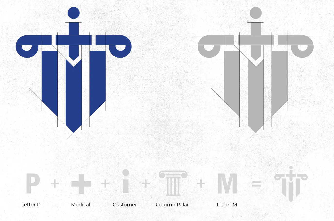
This logo is a composite of key elements that represent the core values of Panacea Medicolegal Services. The P stands for the brand name, while the medical cross symbolizes the focus on healthcare and legal services. The dot reflects the importance of the client or customer, who is at the center of the brand’s operations. The column pillar evokes strength, stability, and trust, key attributes in both medical and legal fields.
Finally, the letter M complements the initial P, combining to create a unified symbol of integrity, support, and comprehensive service offerings. The final mark is reminiscent of a medical sword, signifying protection and justice, essential to the medicolegal domain.
Both options represent different visual expressions of strength, trust, and the blending of medical and legal services.